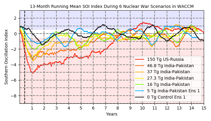
 Southern
Oscillation Index (SOI) for 15 years following the soot injection
for all 6 scenarios. Good depiction of how quickly the atmosphere
evolves into an El Nino state.
Southern
Oscillation Index (SOI) for 15 years following the soot injection
for all 6 scenarios. Good depiction of how quickly the atmosphere
evolves into an El Nino state.
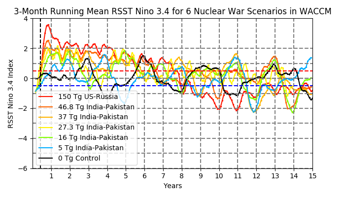 Relative
Sea Surface Temperature Anomalies in the Nino 3.4 region for 15
years following the soot injection for all 6 scenarios. Highlights
quick response of the ocean to an El Nino state.
Relative
Sea Surface Temperature Anomalies in the Nino 3.4 region for 15
years following the soot injection for all 6 scenarios. Highlights
quick response of the ocean to an El Nino state.
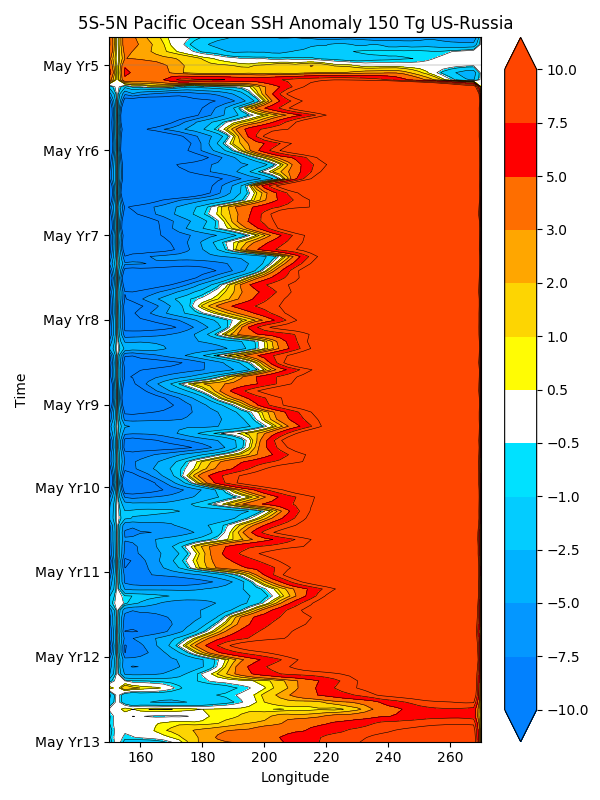
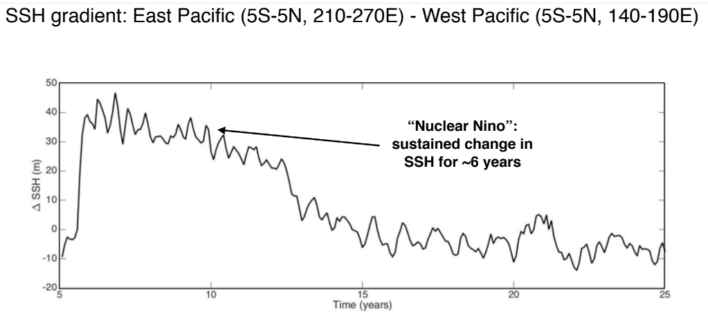 Sea
Surface Height Gradient across the equatorial Pacific for 15 years
following the soot injection. A direct measure of the quick
response of the ocean to atmospheric dynamics.
Sea
Surface Height Gradient across the equatorial Pacific for 15 years
following the soot injection. A direct measure of the quick
response of the ocean to atmospheric dynamics.
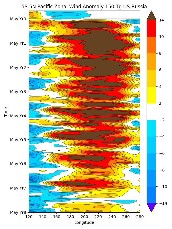
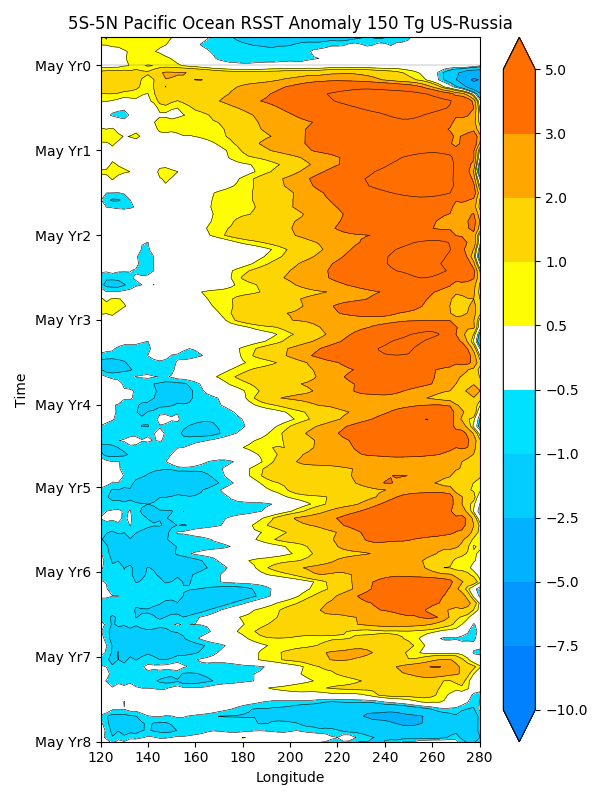
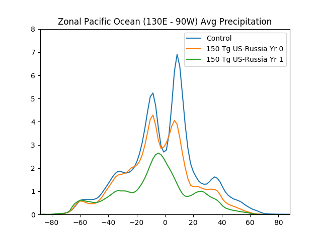
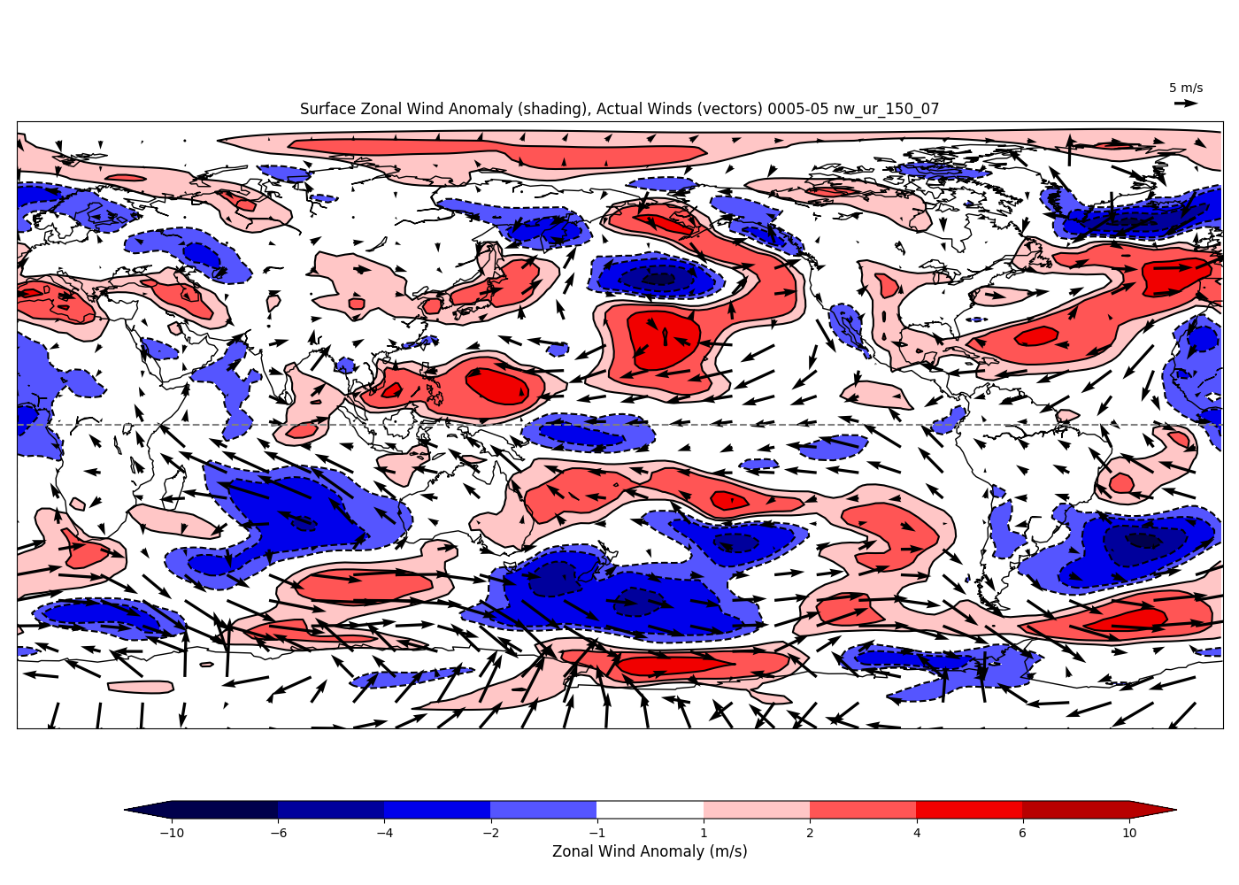
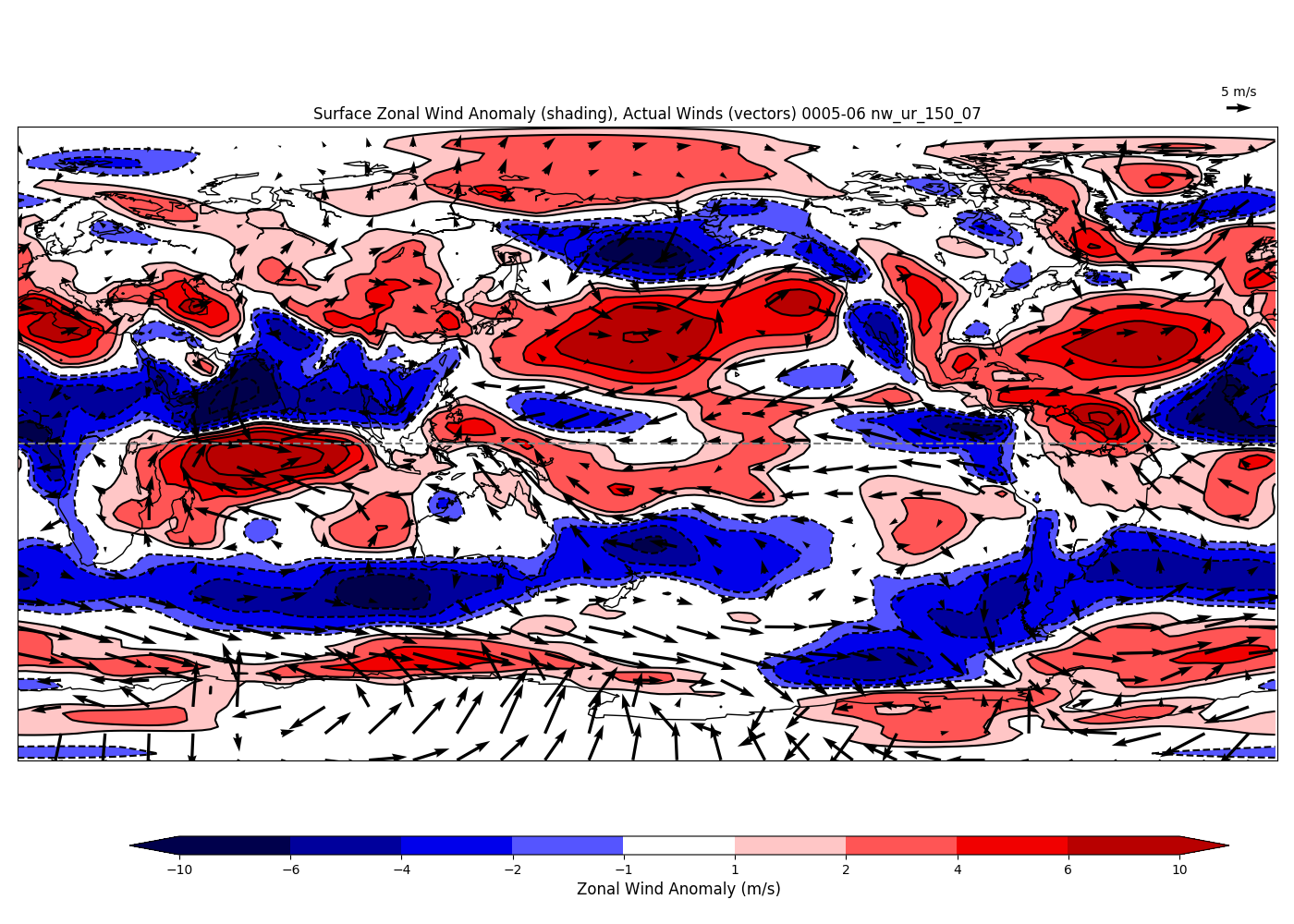
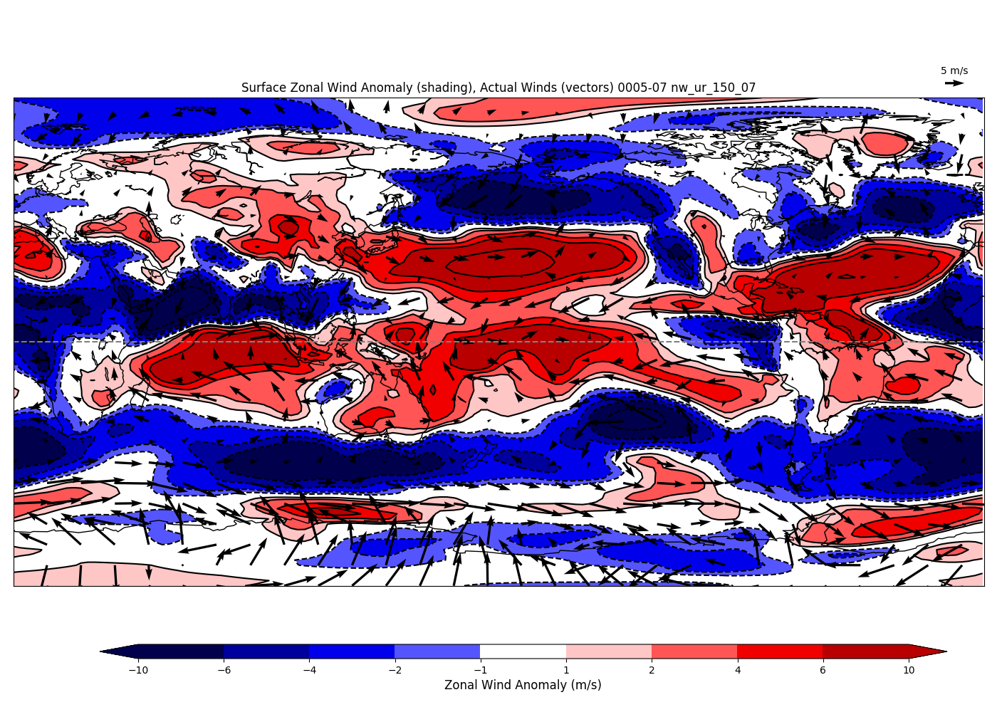
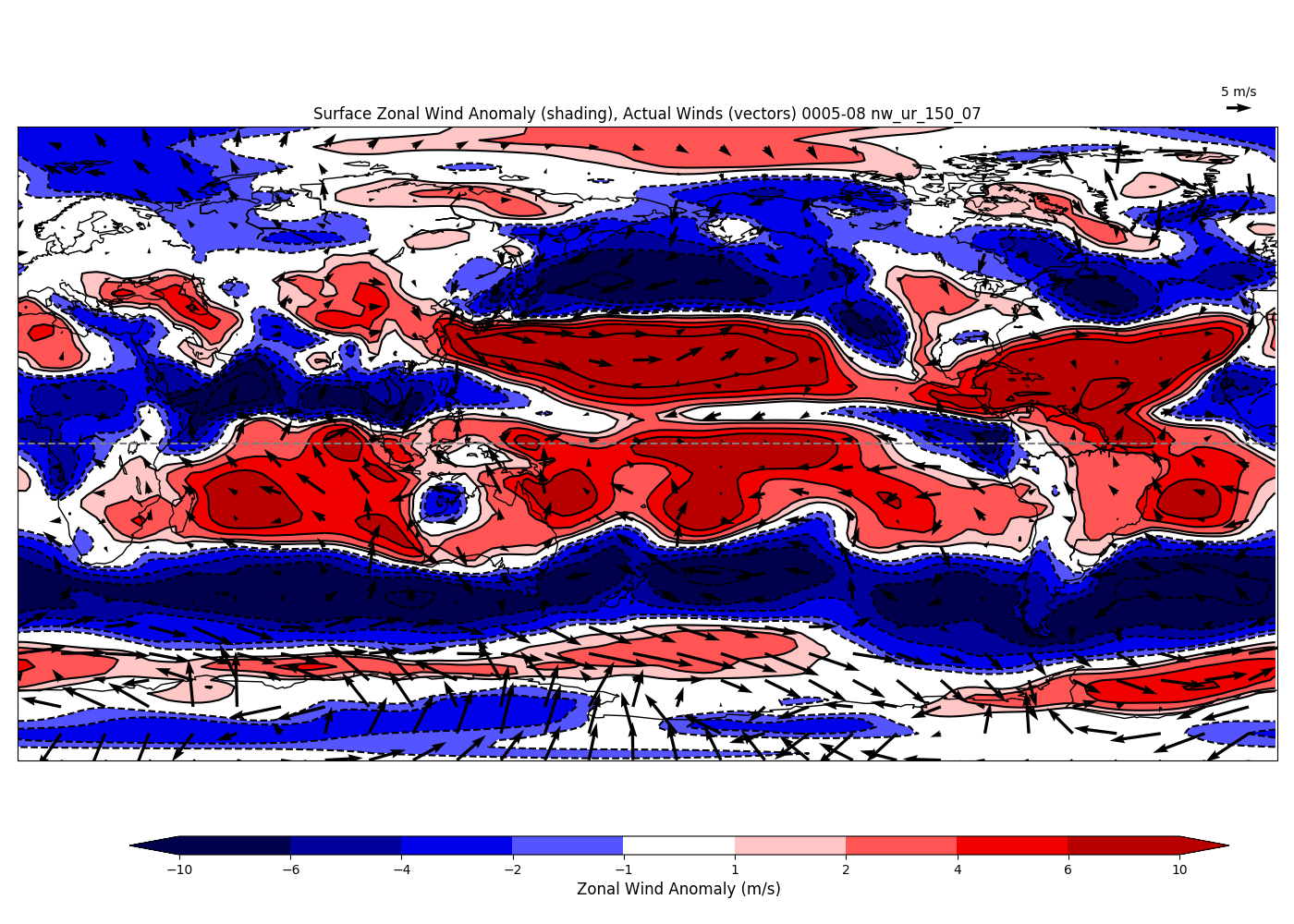
Maps of SSTs, zonal wind anomalies in the months after the soot injection.
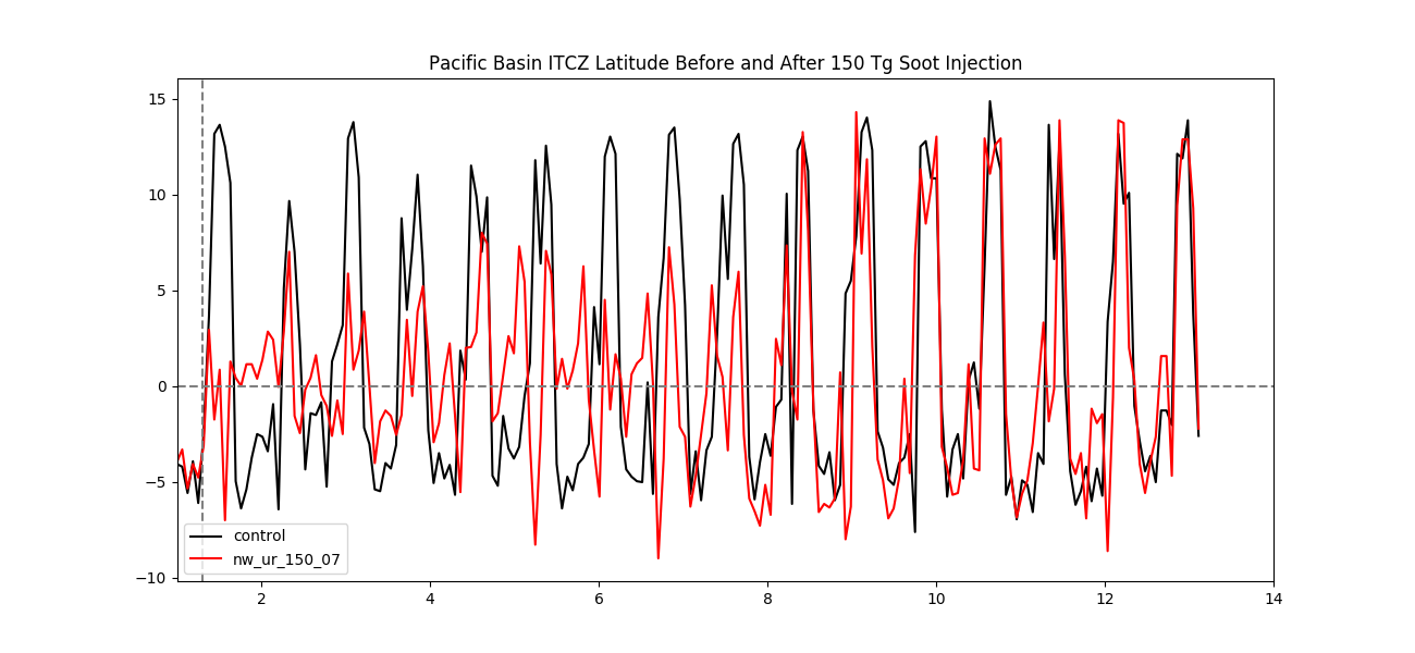
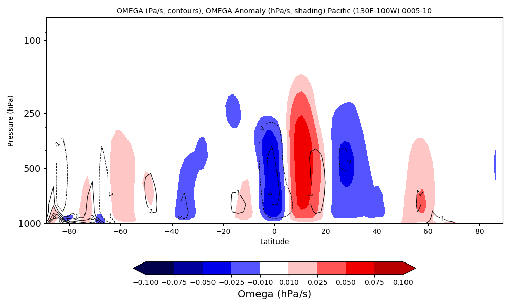
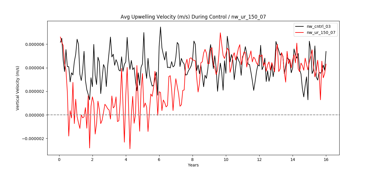 Plot
of reduction in upwelling. Shows the deviation from the normal
amount of upwelling along the equator. Also have plots showing
vertical velocity anomaly, which is decidedly negative along the
equator.
Plot
of reduction in upwelling. Shows the deviation from the normal
amount of upwelling along the equator. Also have plots showing
vertical velocity anomaly, which is decidedly negative along the
equator.